The graphs showing the main results can all be accessed by scrolling. Click on the drop-down menus for more information.
Before exploring the modeling scenarios
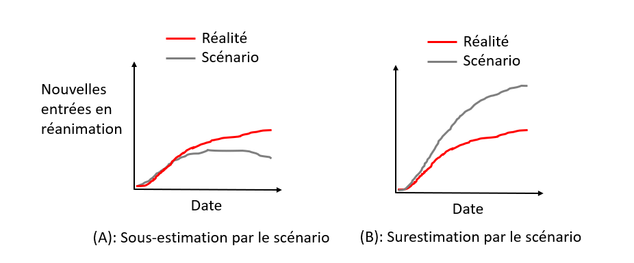
What is the point of studying modelling scenarios reliability
? (click to unfold)
In the case where the modelling scenarios underestimate the evolution of the epidemic (A), the risk is not to react, or not enough. Conversely, if the scenarios overestimate the evolution of the epidemic (B), the risk is to overreact and in particular to take too many measures with deleterious effects without being justified. Indeed, most of the measures taken to curb the epidemic (lockdown, curfew, school closure, closure of public places) have negative health, social and economic impacts. Therefore, overreacting to the epidemic is not a good thing (nor is under-reacting).
A more detailed explanation is available on the Impact page.
Isn’t the point of modeling to prevent worst-case scenarios
from happening ? (click to unfold)
An common argument about modelling scenarios is that since the scenario anticipates the worst, it leads to measures being taken that will prevent the modelled scenario from occurring, which explains the discrepancy between the modelled scenario and reality (where measures have been taken!). Indeed, it is not possible to establish a comparison in this case.
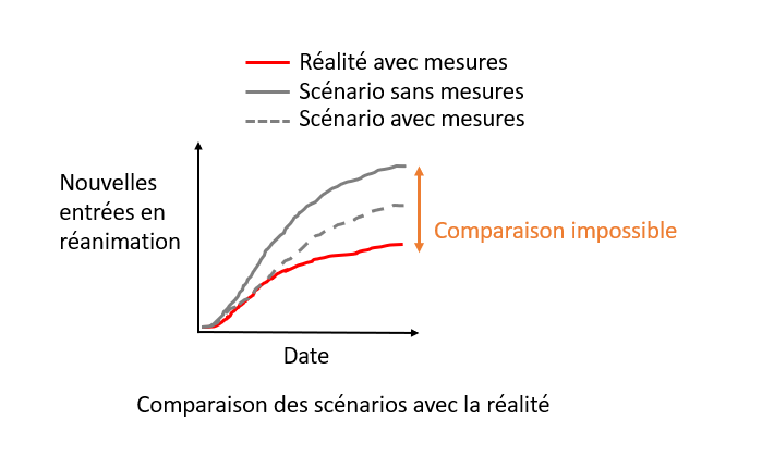
However, modeling scenarios often incorporate several assumptions about the measures that could be implemented. Here, we will only compare reality with scenarios where the implemented measures were also modeled.
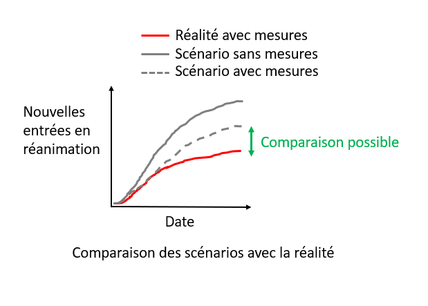
Thus, the comparison between modeling scenarios and reality will make it possible to evaluate whether they have correctly anticipated reality.
Review of the main modeling scenarios
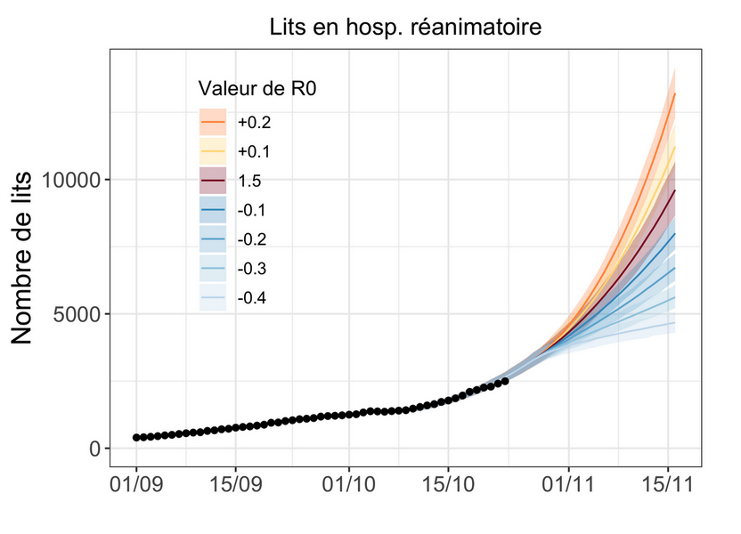
1. March 2020, the model that led the world towards lockdown
Context (click to unfold)
By March 2020, there was a great deal of uncertainty about the impact that covid-19 would have. When Italy began to be heavily affected in mid-March, many European countries realized that covid-19 was likely to have significant consequences. To anticipate the evolution of the pandemic, policy-makers turned to the field of epidemiological modelling.
A team of scientists from Imperial College (London), led by Professor Neil Ferguson, published on March 16 the report that led many European governments, including the French government, to implement lockdowns. The scenarios presented in the report anticipated, without any measures, about 500,000 deaths in less than 3 months in the UK, and similar figures for France. Implementing standard measures such as planned in pandemic preparedness (mitigation strategy) plans would yield 250 000 deaths. The report argued that only the implementation of stricter measures to suppress the virus (such as lockdown) would allow the wave to be contained and that it would be the only way to avoid saturating the hospital system. Relying on this report, many governments have chosen to implement lockdown-style strategies.
Of course, projections of what would happen in the absence of measures cannot be compared with what actually happened in a country that implemented a lockdown. This is one of the most common counter-arguments to the critics of epidemiological models: it is precisely because of the measures that the modelling scenarios did not come true.
But there is one country that allows us to test the validity of the modeling scenarios: Sweden. In the first wave, Sweden chose not to confine itself, preferring to rely on lighter measures. It is therefore possible to compare what the scenarios for Sweden predicted and what actually happened.
Comparison of scenarios to real data (click to
unfold)
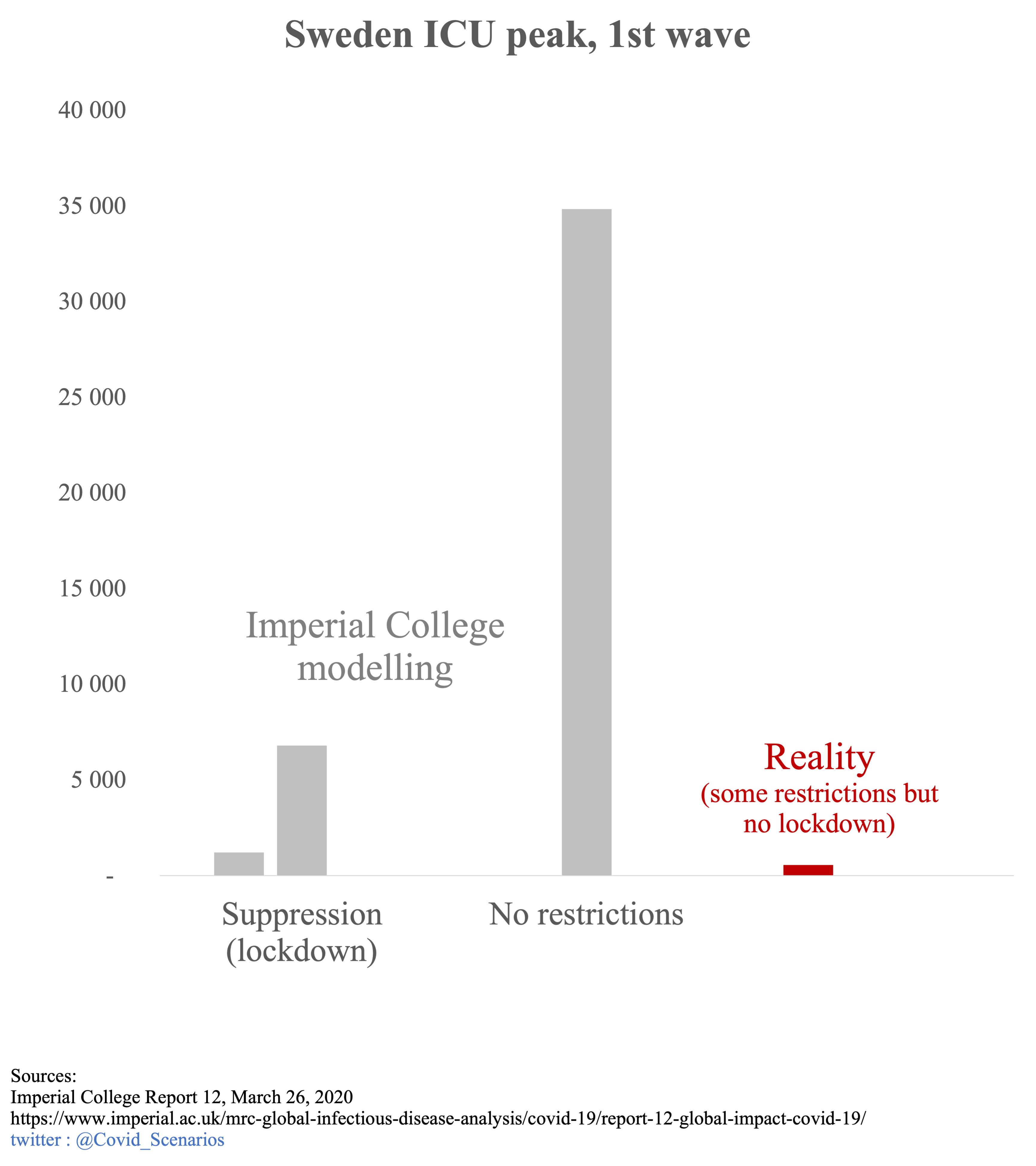
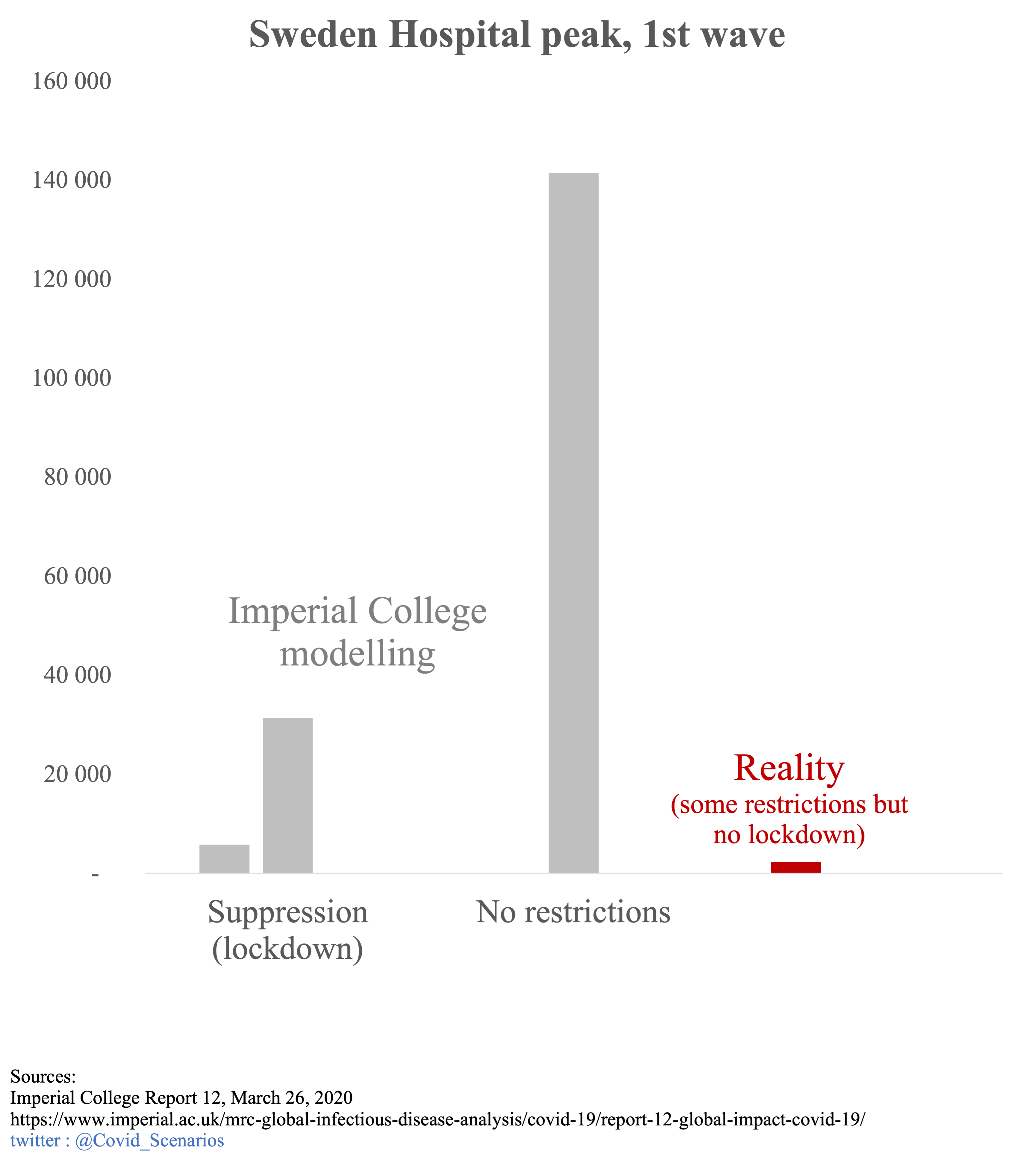
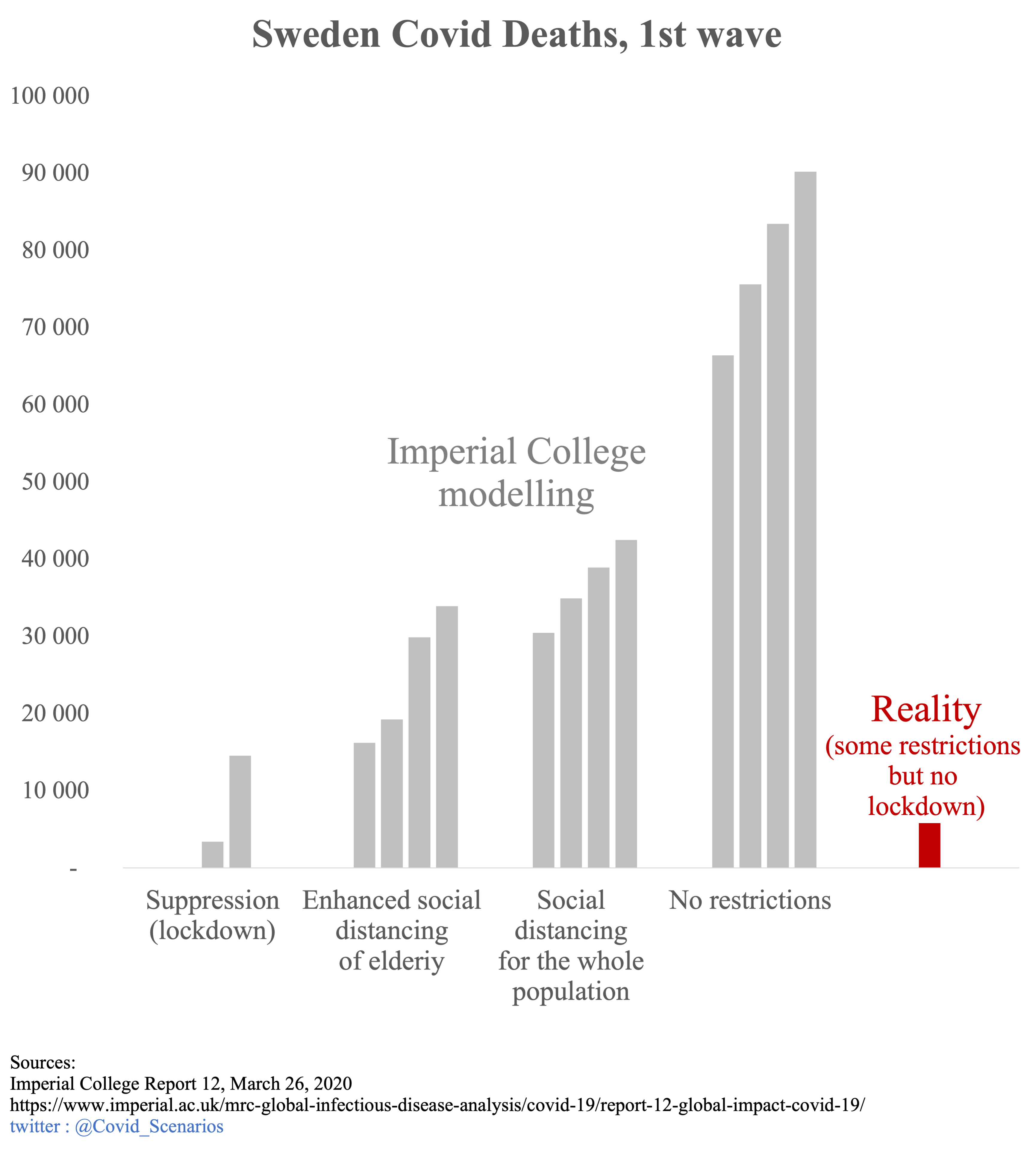
The appendix of the Imperial College report 12, published on March 26, contains models of the epidemic in all countries, including Sweden.
The first 2 graphs represent the peak occupancy of ICU and hospital beds. The gray bars represent the Imperial College scenarios: early strict lockdown, late strict lockdown, and no action. The red bar represents the reality. Since Sweden has implemented social distancing measures without imposing lockdown, the observed numbers should have been somewhere between the “lockdown” and “no restrictions” scenarios. The reality is quite different. Even though Sweden did NOT implement lockdown, the scenarios WITH lockdown overestimate the peak of used beds by a factor 2 to 10. A scenario with some restrictions should be between lockdown and no restrictions scenarios, yielding a overestimation by a factor 10 to 60.
The last graph shows the different Imperial College scenarios for mortality in grey, and the actual number of deaths in red. Here again, the scenarios greatly overestimate mortality. The actual number of deaths corresponds to the early lockdown scenario, which was obviously not the approach taken by Sweden. The intermediate scenarios of social distancing overestimate mortality by a factor 3 to 7.
ICU peak
Hospital peak
Deaths
Political and media impact (click to
unfold)
These models were one of the main triggers for the French national lockdown (which will influence other European countries to follow the same path). In its report of March 12, 2020, the Scientific Council asserted that the classical measures used to limit the spread of epidemics would not allow to sufficiently limit the circulation of the virus, implying the necessity of a strict confinement. This assertion was based on the Imperial College modelling :
It is not expected that the reduction in the size of the epidemic peak will be sufficient to avoid saturation of the health system. (…) This intuition was illustrated through the realization of a particular COVID19 model (Neil Ferguson, personal communication)
Extract from the report of the Scientific Council of March 12, 2020
Since the figure above shows that these models vastly overestimated what would happen with conventional disease control measures, this claim is likely to be challenged.
The political influence of these models continues long after March 2020. When in July 2021 the Spanish Constitutional Court declared the first lockdown unconstitutional, the Minister of Justice countered by assuring that it had saved 450,000 lives in Spain.
That is not me talking, but established by independent scientific studies - as a result of this lockdown, 450,000 lives have been saved. We have lost the lives of more than 27,000 fellow countrymen, but we have saved the lives of 450,000 people
President of the Government of Spain, Pedro Sánchez
While the source of this figure is not specified, it does correspond to the pessimistic scenario of the appendix of the report 12 of Imperial College applied to Spain. The case of Sweden questions this statement. Indeed, had the Swedish government locked down its population, it could have claimed, like the Spanish minister, that its action saved 90,000 people. We know that this is not the case, as the real death toll without lockdownd was 5,000, or 18 times less.
Discussion of scenario assumptions (technical)
(click to unfold)
For fatalities, Imperial College has developed 4 scenarios:
- No action
- Mitigation: social distancing of the population in a uniform way (40% reduction of contacts)
- Mitigation: same as 2. but with increased social distancing of the over 70s (60% reduction in contacts for this category)
- Suppression of transmissions (lockdown): expanded and intense social distancing (75% reduction in contact for the entire population).
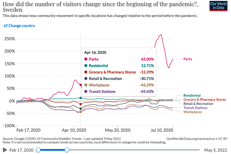
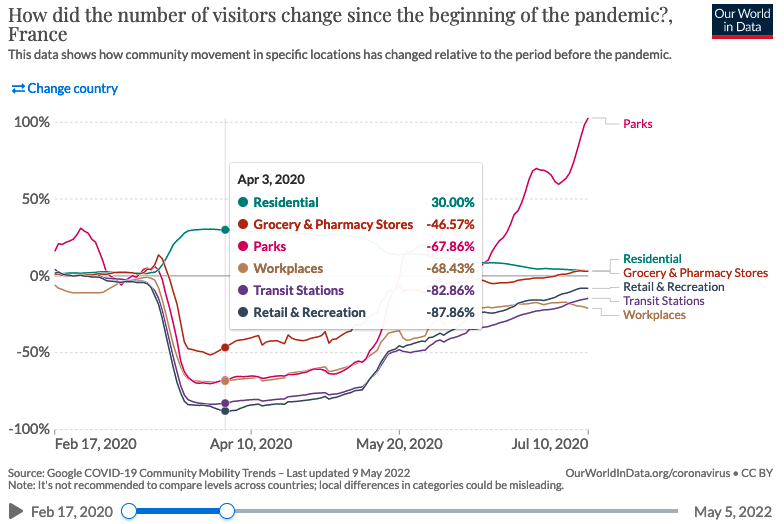
It is impossible to measure the actual reduction in contact, but mobility data can provide an approximation. In Sweden, the use of workplaces, train stations, and shopping and leisure facilities was reduced by a maximum of 30-45%, and food stores and pharmacies by 10-15%. This seems to confirm that Sweden was not leaning towards scenario 4, but rather towards a slight mitigation. For comparison, in France, the use of workplaces, shops and leisure facilities was reduced by 70-90% and food stores by 50%, which is in line with scenario 4 of lockdown.
Although not corresponding to reality, we have chosen to represent the “no action” scenarios for several reasons:
In the case of intensive care units and hospital peaks, no intermediate scenario was produced, only the “lockdown” and “no restrictions” scenarios. Presenting these 2 scenarios allows to imagine where the reality should have been, somewhere between the two.
Although unrealistic, the “no action” projections are often put forward as a counterfactual to the absence of lockdown, as illustrated by the case of the hospital peak mentioned above. This is also the case in the press (figure of 500,000 deaths in the UK) or by politicians (figure of 450,000 people saved according to the Spanish Minister of Justice). This article by BFM even states that a mitigation strategy is a “laissez-faire” strategy :
By “laissez-faire,” researchers mean so-called mitigation measures, such as quarantining identified Covid-19 cases and their relatives and closing schools
2. April 2020, Île-de-France lockdown exit
Context (click to unfold)
On April 29, 2020, during the first lockdown, an article in the newspaper Les Echos reported on unreleased models from the Pasteur Institute. These models were about the evolution of the epidemic post-lockdown. The Ministry of Health indicated that these models were not finalized and were being analyzed, and therefore could not be made public for the moment. To our knowledge, they have not been made public subsequently.
Comparison of scenarios to real data (click to
unfold)
At the end of June, the most optimistic scenario overestimates the actual data by 66%. The median and pessimistic scenarios are 3.5 and 9 times above reality.

Impact politique et médiatique (click to
unfold)
Although the report that led to these models has not, to our knowledge, been made public, they have nevertheless been communicated to the press and the government, as reported in the article in Les Echos:
It is perhaps the modelling carried out by the Pasteur Institute for the ARS Ile-de-France and the AP-HP - by Professor Simon Cauchemez - that invites the government to be cautious. Dated Tuesday and for internal use, they show that the number of patients in intensive care will remain high for a long time, at least until the summer. And that whatever the scenarios.
The confidentiality of the report from which these curves were taken raises the question of the transparency of the models. Similarly, the Scientific Council report of March 12, 2020 referred to the Imperial College models used in the report as “Neil Ferguson, personal communication”, without additional information.
Discussion of scenario assumptions (technical)
(click to unfold)
As the models are not public, it was not possible for us to study the assumptions of the scenarios. The article in Les Echos simply mentions different reproduction rates for the virus, 1.2, 1.5, or more.
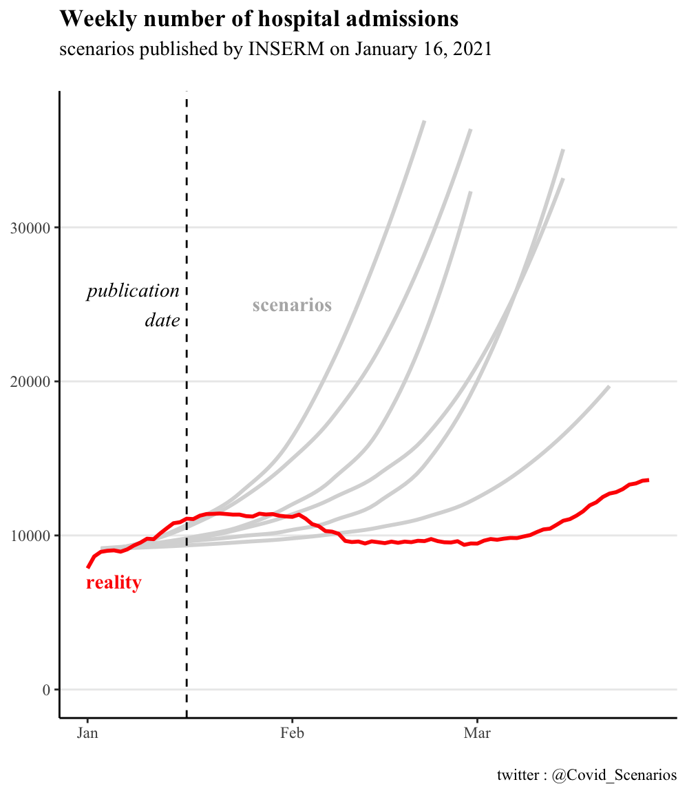
3. November 2020, 2nd wave, and 2nd lockdown
Context
On October 26, 2020, Pasteur Institute produced scenarios for the evolution of the epidemic in the absence of lockdown. To our knowledge, this report has not been made public, and we have not been able to consult it. We simply found a figure extracted from the report, which can be found on this page.
On October 28, 2020, faced with the prospect presented by these figures, Emmanuel Macron announced a generalized lockdown, which would take effect on October 30.
On October 30, the Institut Pasteur produced an update of its scenarios to take into account the impact of lockdown. The report has not been made public to our knowledge. However, some media have had access to it, and have reproduced the scenarios. The article from Les Echos is our source for our graphics.
Comparison of scenarios to real data (click to
unfold)
The most optimistic scenario is close to the actual peak of occupied ICU beds (+15%). The median and most pessimistic scenarios are at +30% and +100%.
ICU peak

ICU admissions

Political and media impact (click to
unfold)
The modelling of October 26 was one of the triggers for the 2nd lockdown. Notably, during his October 28 speech, Emmanuel Macron announced that the number of patients in intensive care would exceed 9000 “whatever we do”. The actual peak will be half that number, at about 4800 critical care beds. It can be seen that in order to justify a political decision, only the most pessimistic model was put forward by the executive. It was also presented as a certainty, even though it was only one scenario among others.
These models were also widely reported in the press: “Second wave: worrying scenarios” was the headline on LCI after the announcement of the second lockdown, presenting scenarios with ICU peak levels of 5,500, 6,200 and 9,000 patients.
Discussion of scenario assumptions (technical)
(click to unfold)
As the report has not been made public, it has not been possible for us to explore the assumptions of the scenarios in details. According to the elements reported by Les Echos, the different scenarios correspond to different values of reproduction rate “R” from 0.7 to 1.2, reflecting a more or less marked efficiency of the lockdown.
4. Winter 2021, extended curfew
Context (click to unfold)
During the emergence of the British alpha variant, the Scientific Advisory Board report of January 12, 2021 has produced initial preliminary estimates of its highly uncertain impact, both in terms of the size of the hospital peak (from 7,000 to 40,000 critical care beds) and the date of the increase (from February to April), making it impossible to compare the curves with reality.
However, these projections will be refined in a succession of reports from INSERM and Institut Pasteur from mid-January to mid-February. These scenarios were used as a basis for considering the implementation of strict containment in early February, which in the end did not take place, providing an opportunity to compare the projections with what actually happened.
From December 15, 2020, an 8pm curfew was in place throughout France. It was be brought forward to 6pm for 15 departments on January 2, 2021, then for the whole country on January 16.
The first regional lockdowns were implemented on March 20, followed later by others until the national lockdown on April 3. The latency between the implementation of measures and their effect on hospitalizations being at least one week, and even 2 to 3 weeks as indicated by the scientific council report (the first effects of the measures adopted […] can only appear after two to three weeks), we stop our graph at March 27. Beyond that point, it is no longer legitimate to compare the dynamics of the pandemic to the no lockdown scenarios.
Comparison of scenarios to real data: Inserm
scenarios (click to unfold)
Note: the January 16 and February 2 scenarios partially considers the impact of the 6pm curfew. The February 14 scenario fully considers them. We discuss the choice of scenario inclusion below in the Discussion of Scenario Assumptions section.
The INSERM scenarios (here, here and here) carried out over 1 month all point to an exponential increase in hospital admissions. The reality will be a slight decrease followed by an increase back to around the initial level. Virtually all scenarios exceed 30,000 weekly admissions by mid-March, with no sign of a slowdown in momentum, whereas the reality is around 10,000, or 3 times less. The most optimistic scenarios overestimate hospital admissions by a factor of 50-100%.
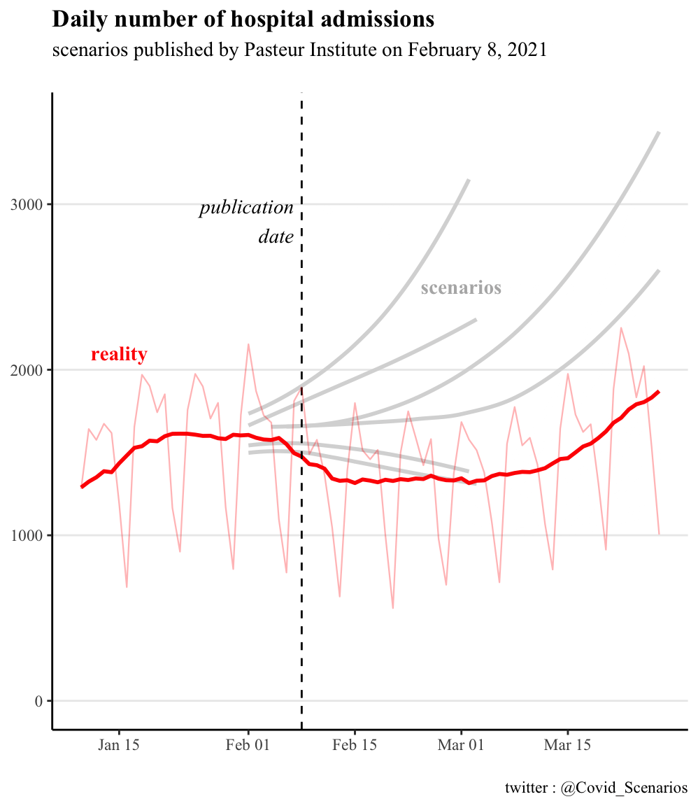
Comparison of scenarios to real data: Pasteur Institute
scenarios (click to unfold)
Note: all these scenarios take into account the impact of the 6pm curfew.
For the February 8 report, the 2 main scenarios extending into March reflect a “no vaccination” hypothesis and an “optimistic” vaccination hypothesis. It is specified that ” in practice, the impact of the current campaign is likely to be intermediate between the scenarios with and without vaccination”, hence our choice to represent these 2 curves. Later in the report, secondary variants are presented to illustrate the influence of a small variation in reproduction rate: these are the curves stopping at the beginning of March.
The most optimistic scenario sticks to reality until mid-March. This was not the main scenario presented to decision-makers (cf. the 2 scenarios extending into March). The others overestimate actual admissions by a factor of 50-100%.
For the February 23 report, the median scenario broadly corresponds to reality, which is around the median scenario.
No mention is made of the significant difference with the scenarios in the previous report of February 8.
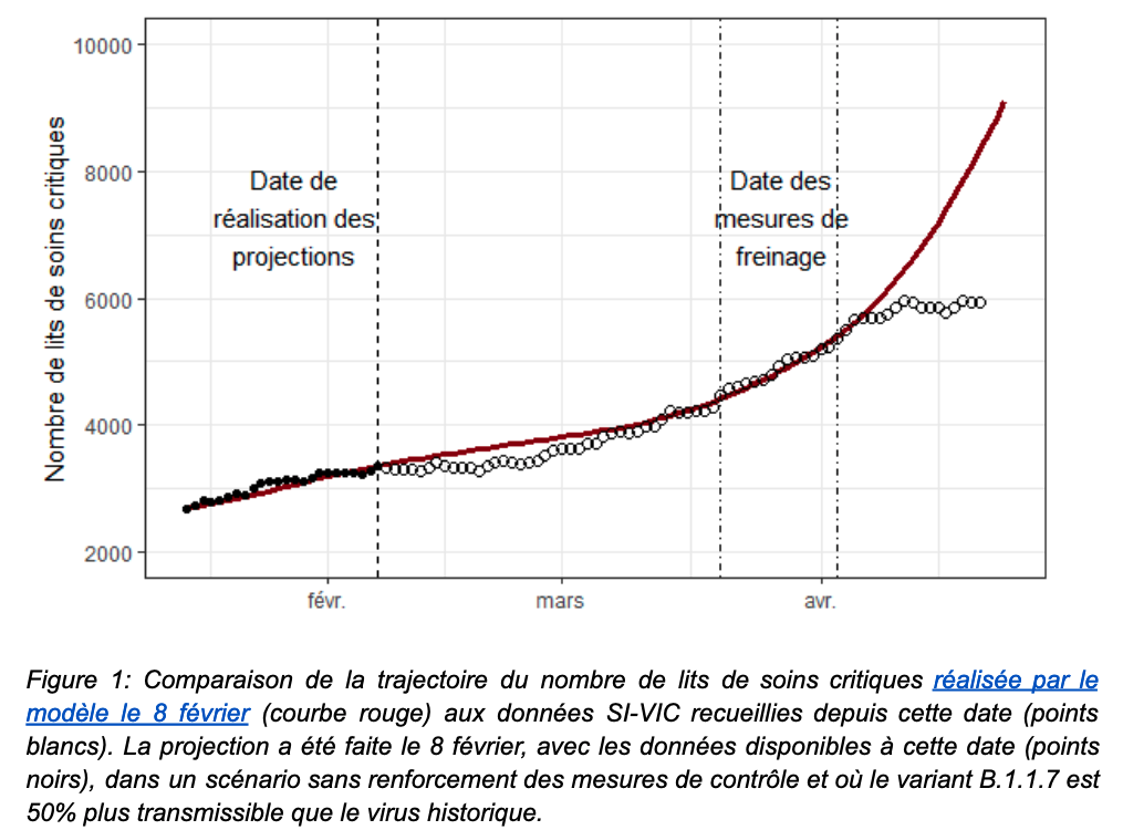
Institut Pasteur’s self-evaluation (click to
unfold)
A retrospective assessment of the February 8 report will be made in a subsequent April 26 report. It states that
As early as February 8, this model anticipated that the curfew would be effective in containing the circulation of the historical virus but would not prevent a significant increase in hospitalizations in the absence of additional measures.
This statement is accompanied by the figure below. One year into the pandemic, this figure will be the first retrospective comparison officially published by the Pasteur Institute.
However, we could not find such a projection in the February 8 report. All those we found are represented on our graphs presented above.
Political and media impact (click to
unfold)
The INSERM modelling of January 16 explicitly advocates for thougher social distancing measures in its summary :
“These findings show the need to strengthen social distancing measures”
Strikingly, it acknowledges not taking into account the curfew, a measure whose very target was not to implement a lockdown
It does not account for the curfew anticipated to 6pm and extended to the national territory on January 16, 2021. The evaluation of this social distancing measure will be performed on epidemic data in the next few weeks. For this reason, we provided a more optimistic scenario assuming a stable epidemic activity.
Note that while the impact of the curfew is only partially taken into account in the reports of January 16 and February 2, it is fully integrated in the report of February 14. You will find more details in the following section Discussion of (technical) scenario assumptions.
These results were also presented in a Scientific Council Special Report on January 29, 2021, stating that these results show the need for rigorous social distancing measures to deal with the threat of the variant and studying the implementation of strict containment in early February.
Discussion of scenario assumptions (technical)
(click to unfold)
About the INSERM scenarios:
January 16 report: the scenarios correspond to 3 reproduction rates of the historical variant (1, 1.1 and 1.2), coupled with a 50% or 70% more transmissible alpha variant. The curves are taken from Figure 1.
report of February 2: the scenarios correspond to 3 reproduction rates of the historical variant (0.9, 1.1 and 1.2) coupled with a more transmissible alpha variant 50%. The curves are the gray curves in Figure 2 (redundant with the curves in Figures 1 and 3).
February 14 report: 50% more transmissible alpha variant. The transmissibility of the historical virus is not given. In addition to the standard projection, 2 scenarios exploring a variation in the transmission of the historical variant of +/- 10% illustrate a reduction or a reinforcement of the measures. The reality did not correspond to either of these 2 scenarios, but we chose to represent these 2 scenarios so as not to be accused of arbitrary exclusion, since a 10% variation could naturally and randomly occur.
About the Pasteur Institute scenarios:
report of February 8: the scenarios correspond to 3 reproduction rates of the historical variant (0.9, 0.95 and 1), coupled with a 40%, 50% or 70% more transmissible alpha variant. The curves are taken from figures 2a, 6a, 7c
report of February 23: many variations are proposed, because as the report underlines in view of the great uncertainty “a single forecast for the coming months is not possible”. In detail, the different hypotheses concern the greater transmissibility of the alpha variant (+40%, 50% or 70%) and a change in the epidemic trajectory (decrease and increase of 8% or 16%) which occurs at different dates (February 22 or March 8). The curves are extracted from figures 2c, 5a, 5c, 5e, stopping at 27 March before the lockdown as explained in the “context” paragraph.
About all scenarios
The alpha variant is assumed to be only more transmissible, and does not increase the risk of hospitalization. This will be modified in subsequent reports, for example the one from April 26, 2021, where the probability of hospitalization is increased by 64% with alpha infection.
For all reports, we stop extracting curves on March 27 as explained in the context paragraph, the first confinements being implemented on March 20 and the effect of the measures on hospitalizations taking at least a week to materialize (cf scientific council report, “the first effects of the measures adopted […] can only appear after two to three weeks”).
About scenarios that do not include the anticipated curfew.
The INSERM reports of January 16 and February 2 deserve clarification, as they state that the effect of the early 6 p.m. curfew is not taken into account, but that the most optimistic scenario could reflect the measure. Should we have kept only this one and excluded the other scenarios? Our decision to keep them all was based on several points:
First of all, the authors have chosen to represent them, indicating that they themselves validate the relevance** of these scenarios. Indeed, it is on the basis of these scenarios that they assert that “new hospitalizations are expected to reach around 25,000 between mid-February and early April in the absence of intervention”.
Based on these results, they also gave explicit policy recommendations**: “These results show the need to reinforce social distancing measures”, even though the curfew, whose very purpose is to avoid more restrictive measures, was not modeled.
Finally, we see that the scenarios for January 16 and February 2 are very similar to those for February 14, even though the latter incorporates the effect of the anticipated curfew, indicating that taking the curfew into account changes the results only slightly.
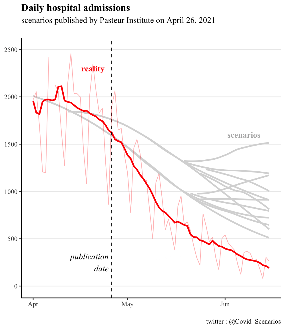
5. May-June 2021, exit from the 3rd lockdown
Context (click to unfold)
Scenarios are published on April 26 and May 21, covering epidemic trajectories for the end of the 3rd containment period and the summer. We stop the comparisons in mid-June, when the delta variant appears, and the models cannot anticipate this.
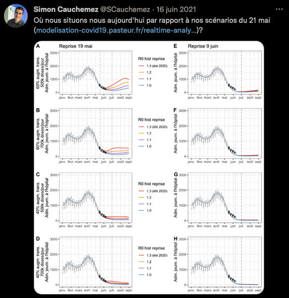
An informal self-evaluation of the May 21 report was published on the twitter account of Simon Cauchemez, in charge of the Institut Pasteur modeling team. To our knowledge, this was not done for the April 26 report. The self-assessment does not mention the difference observed with the April 26 scenarios.
Comparison of scenarios to actual data (click to
unfold)
For the first report, the scenarios are above reality in mid-June, with overestimation ranging from a factor 2 to 6.
On the other hand, the observed recession follows faithfully the scenario of the second report, as shown in the screenshot of Simon Cauchemez. He does not mention the discrepancy in the first report.
April 26 and May 21 - Hospital Admissions
May 21 - ICU beds

Self-Assessment by Pasteur Institute (click to
unfold)
Here is the informal comparison of the May 21 scenarios with reality carried out on the twitter account of Simon Cauchemez, in charge of the Institut Pasteur modeling team.
No such work was carried out for the April 26 scenarios, and to our knowledge no comment has been made on the significant difference between the April 26 and May 21 scenarios.
Political and media impact (click to
unfold)
These models supported the Scientific Council report of May 6, 2021. Although the Scientific Council specifies that “These projections […] are not predictions”, it relies on them to estimate that under plausible assumptions, a significant rebound of the epidemic is possible during the summer period if control measures are relaxed too quickly, even when considering a significant rate of vaccination. This is one of the arguments that pushed the Scientific Council to position itself in favor of a “prudent and controlled” reopening of social activities following the 3rd lockdown.
Several epidemiologists made statements in line with the Pasteur Institute April 26 report. Here and there for instance, on April 27 :
It will take at least 50 days to see a drop in hospitalizations
We will remain at 5,000 or 6,000 Covid patients for weeks
The decrease occured the next week, and 50 days later (June 15) there were less than 1,000 ICU patients. Other examples can be found on April 19 and May 5
I don’t see how we can expect a massive drop by the end of May
The probability of avoiding a new total saturation of the hospital is low
Discussion of scenario assumptions (technical)
(click to unfold)
For the April 26 report, the curves are taken from Figures 3b and 3d. The assumptions made in the scenarios are as follows:
A 60% or 40% more transmissible alpha variant compared to the original strain
More or less rapid lifts of the measures, resulting in recovery reproduction rates R from 1 to 1.3, starting May 15. We excluded the most pessimistic scenario (R = 1.3) which corresponded to an almost total lifting of the measures from mid-May, which was not the case.
Median or pessimistic assumptions regarding the reduction of hospitalizations
Vaccine efficacy of 90% against severe cases and 80% against infections, 2 weeks after dose 1. Infected persons have full immunity.
Vaccine adherence of 85% for > 65 year-olds, and 70% for 18-64 year-olds.
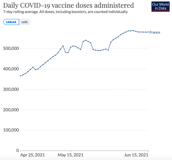
A vaccine distribution rate of 350,000 or 500,000 doses per day. We only kept the 500,000 doses/day scenarios, which are close to reality for May, as shown in the graph below.
The assumptions made in the report of May 21 are much the same. The curves are taken from figures 3A, 3C, 3E, 3G.
Some assumptions are described as potentially over-optimistic by the modelers, such as vaccine adherence. It is also pointed out that the model does not take into account the end of travel restrictions, or the reopening of schools.
In both cases, we stop the comparison in mid-June, when the appearance of the delta variant not predicted by the models and now dominant, renders the assumptions null and void.
6. August 2021, 4th wave and delta variant
Contexte (click to unfold)
A first report from the Pasteur Institute came out on July 9, 2021 in the context of the delta variant spread. Two out of three scenarios presented anticipated a number of critical care beds by the end of August at least equal to the 2nd wave, and in the absence of measures a peak in September well above the 1st wave.
Faced with the prospect of hospital flooding suggested by these scenarios, the extended sanitary pass was implemented on 21 July, leading to a sharp increase in vaccinations and rendering the hypotheses of the 9 of July report obsolete.
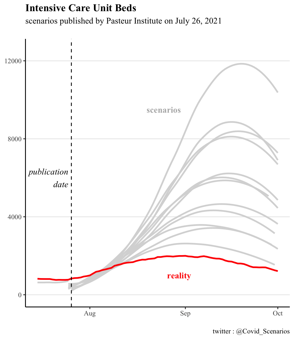
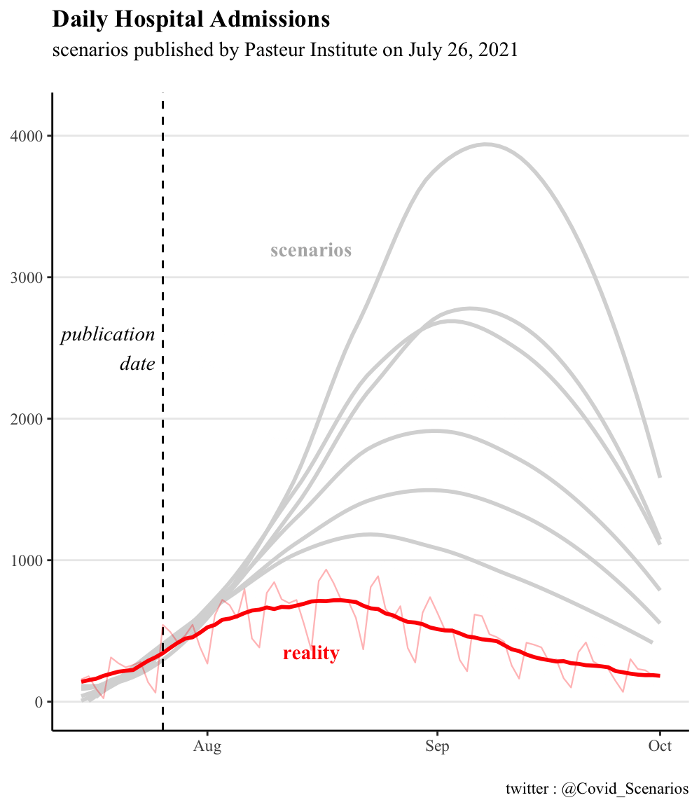
To remedy this, the Institut Pasteur published two new reports, on July 26 and August 5, to take into account the effect of the sanitary pass. We compare these two reports with the actual trajectory.
Comparison of scenarios to actual data (click to
unfold)
For the first report, the reality is about 2 times smaller than the most optimistic scenarios, 3 to 4 times smaller than the median scenarios, 10 times smaller than the pessimistic scenarios.
The report published 10 days later partially corrects this overestimation, the reality corresponding approximately to the most optimistic scenario, but remaining 2 times smaller than the median scenario and 4 times smaller than the pessimistic scenario.
ICU Beds
ICU Admissions
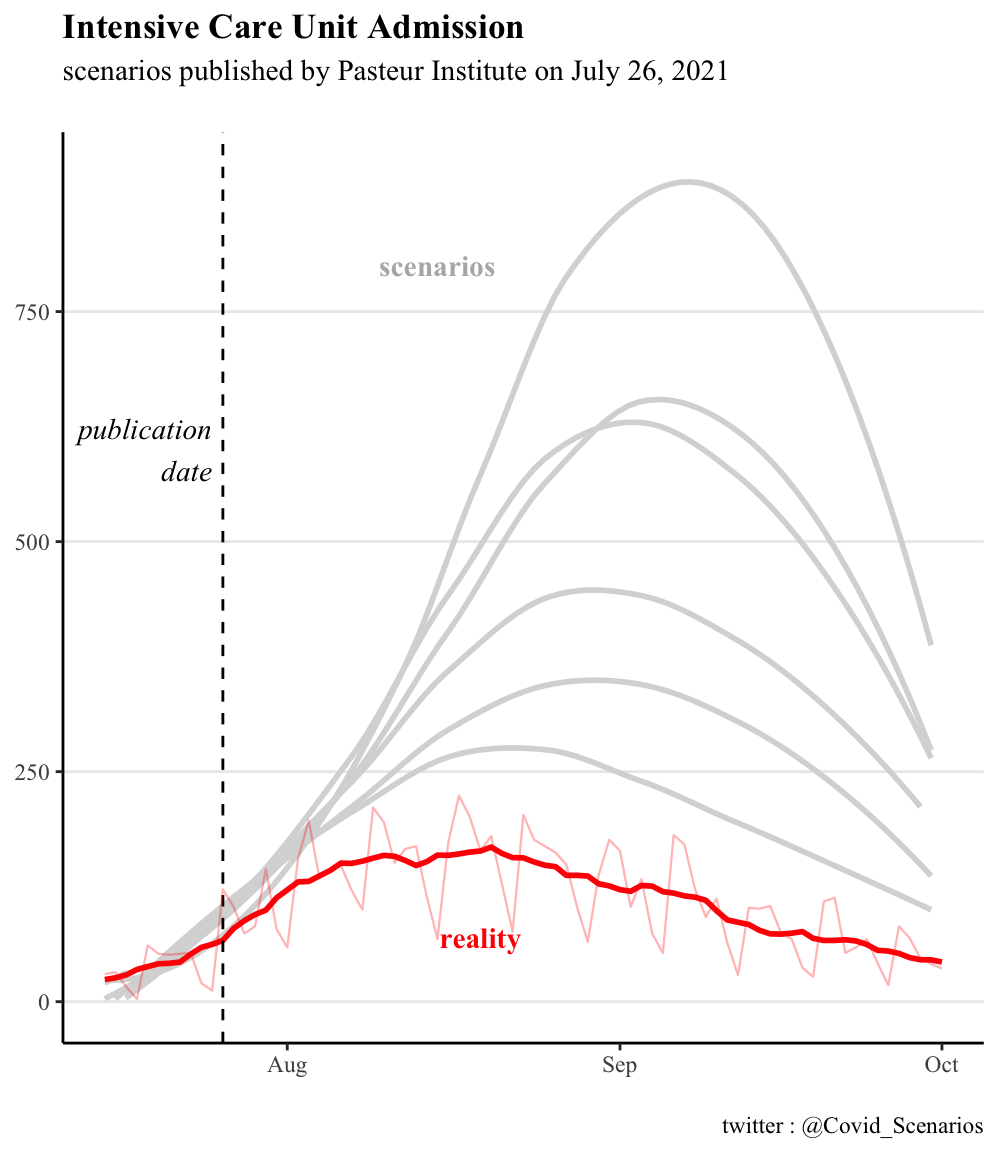
Hospital Admissions
Political and media impact (click to
unfold)
In line with the projections presented, the president of the scientific council Jean-François Delfraissy predicted a complicated hospital situation for the end of August during his hearing before the senators:
The model clearly shows that by the end of August, we will find ourselves in a very complex situation, with an impact on the health care system.
This presentation of the Institut Pasteur’s projections to the Senate occurred before the Senate voted on the extension of the sanitary pass, and may therefore have played a role in the senators’ opinion.
The Institut Pasteur’s modelling was also used by the Conseil d’Etat as an argument to reject the challenges concerning the extension of the sanitary pass. In rejecting these requests, the Conseil d’Etat explained in particular that
The data “could be even more worrisome in early August, according to Pasteur Institute’s modelling.
Interestingly, the United Kingdom faced the same situation in July: an increase in hospitalizations, accompanied by scenarios suggesting hospital overwhelm. Unlike France, the UK did not implement a sanitary pass and lifted almost all control measures. We detail this in the next section.
Discussion of scenario assumptions (technical)
(click to unfold)
The scenarios from the first report are taken from figures 3, 4, 5 and 6. Scenarios whose assumptions did not match reality were excluded from the comparison, reducing the number of variants from 108 to just 6 for admissions and 12 for the number of occupied beds. In detail, these assumptions are :
Critical care length of stay: 14.6 days or 10 days
Reduction in the number of effective reproductions to 1.5, 1.8 or 2 (0, -10% or -20%) due to barrier measures and health pass.
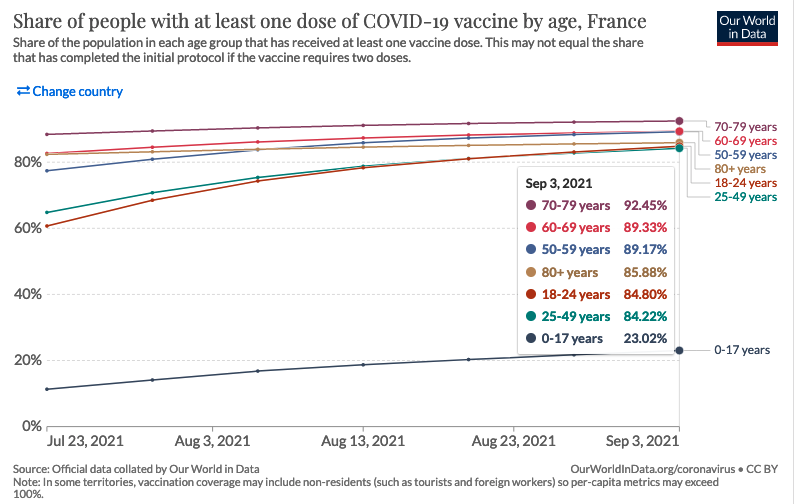
Vaccine uptake among >60 year-olds: 90 or 95%. We have retained only the 90% scenarios, in line with the graph below.
Vaccine uptake among 18-59 year-olds: 70% or 90%. We have only retained the 90% scenarios, in line with the graph below.
Vaccine uptake among 12-17 year-olds: 30%, 50% 70%. We didn’t need to check this hypothesis, because for high adult vaccination coverage (90%), vaccination of adolescents has no impact on hospital trajectory, according to the report’s own results.
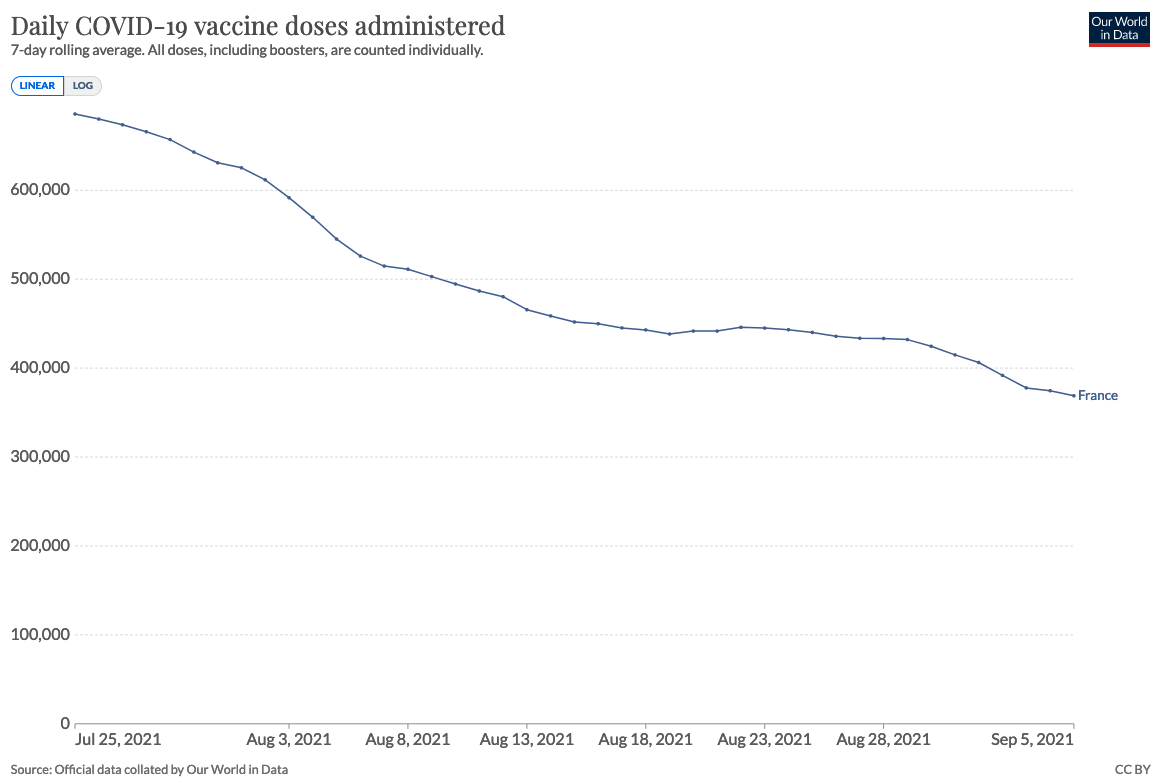
Vaccine doses distributed per day: 500,000, 700,000 or 800,000. We have eliminated the 800,000 doses/day scenarios, which are too far from reality (see graph below). The 700,000 scenario only corresponds to the beginning of August, but we have chosen to keep it, so as not to risk exluding optimistic scenarios closer to reality.
The curves in the second report are taken from figure F. The report makes the following assumptions only
duration of stay in critical care (10, 14 or 17 days)
number of vaccine doses distributed per day (600,000, 700,000, 800,000). In view of the second graph below, we have excluded the 700,000 and 800,000 doses/day scenarios.
reduction in the number of effective reproductions (-10%, -25% or -40%) due to barrier measures and the health pass.
Vaccination uptake: 95% for over-60s, 90% for 18-60s, 30% for 12-17s. These figures are similar to those used for the April 26 scenario.
In addition, a number of assumptions were common to the 2 scenarios:
The delta variant is not considered more likely to result in hospitalization than the alpha variant (+64% for both variants).
Vaccine efficacy 2 weeks after dose 1: 90% against hospitalization, 80% against infection, 50% against transmission.
The model does not assume a drop in vaccine efficacy against the delta variant. It is stated that “this could lead to over-optimistic projections for August”.
Infected people are considered fully immune. It is said that “this could lead to over-optimistic projections”.
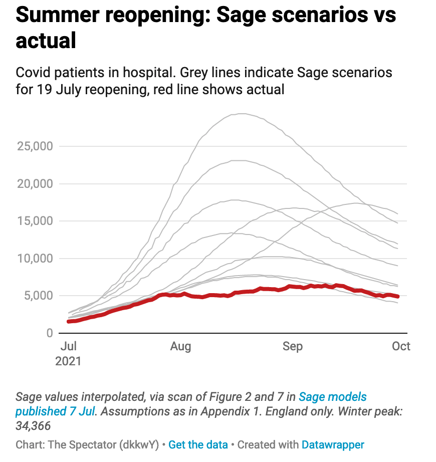
7. Summer 2021, Freedom Day in the UK
Context (click to unfold)
In July, the United Kingdom faced a similar situation to France: an increase in hospital admissions, accompanied by scenarios anticipating hospital flooding. Unlike France, the UK did not implement a sanitary pass and lifted almost all control measures.
We present a comparison between modeling scenarios and reality in the case of “Freedom Day”, the day on which almost all restrictive measures were lifted in the UK. On July 19, as part of its exit plan, the British government decided to lift most of its restrictive measures (such as capacity limitations in places open to the public, compulsory wearing of masks or travel restrictions).
Comparison of scenarios to actual data (click to
unfold)
The data presented below compares actual hospitalized patients with different modeling scenarios to predict the impact of lifting restrictions. The data are from the July 7 SAGE (Scientific Advisory Group for Emergencies) report, and the formatting is from The Spectator.
The actual peak is below the most optimistic scenario, the median scenarios are 2-3 times higher, and the most pessimistic scenario is more than 5 times higher.
Political and media impact (click to
unfold)
This lifting of restrictions was strongly criticized by many scientists in an open letter to the prestigious medical journal The Lancet. They called it “dangerous and premature”. This open letter was picked up by various British and international media outlets, which relied on these models to announce “a third major wave of hospitalizations and deaths” following the lifting of the restrictions, described as a dangerous and unethical experiment”.
The fact that the models greatly overestimated the impact of the reopening was described in the scientific journal Nature by a renowned epidemiologist:
No one really understands what’s going on.
8. Fall-Winter 2021, pre-Omicron
Context (click to unfold)
In a context marked by the generalization of the sanitary pass, the Pasteur Institute published models on the epidemic dynamic during the autumn-winter transition. Although the arrival of the Omicron variant made these models obsolete in December, there is still a 2-month period over which they can be compared with reality.
Comparison of scenarios to actual data (click to
unfold)
Most scenarios are at the level of a contained epidemic circulation, below actual hospital admissions by a factor of 4 to 6.
Scenarios closer to reality correspond to a “relaxation of measures/behaviors by 40%”, which returns to the “control level measured in June-July”, coupled with an unfavorable climate modulation. Although the control measures were not relaxed to the June-July level, when there was no sanitary pass, it is impossible for us to measure the “relaxation of behaviors”, so we kept these scenarios.

Political and media impact (click to
unfold)
These models were taken up by the Scientific Council in its report of 5 October 2021. It recommended that the sanitary pass be maintained for a period running at least until November 15, 2021 (first extension of the sanitary pass). They were also reported in the national press.
Discussion of scenario assumptions (technical)
(click to unfold)
Our curves are taken from figures 7 and 9.
Behaviors/measures reducing transmission to the level of June/July before the sanitary pass (-40% compared with June/July), or to an intermediate level (-20%).
Climate modulation increasing contamination by 33% (estimated), 20% or 40%.
A relaxation of measures/behaviors on October 15 or November 15. The dates of December 15 and January 15 were also studied, but are not of interest to us as they fall outside our study period.
3 hypothesis variants for vaccine efficacy against hospitalization and infection: 95% and 60% (reference), 90% and 60%, and 95% and 80% respectively.
Vaccine efficacy against transmission of 50% if infected.
The delta variant increases the risk of hospitalization by 50% compared to the alpha variant.
Alpha variant increases the risk of hospitalization by 42% compared with the historical strain.
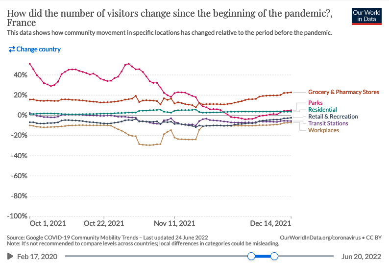
As said before, the “relaxation of social distancing” is an hypothesis impossible to verify. An imperfect measure of it would be Google mobility trend, which shows no real increase over the period :
9. December 2021, second delta wave
Contexte (click to unfold)
In the context of a second delta wave, Pasteur Institute produced 2 reports on November 29 and December 2, 2021 with scenarios covering winter and spring 2022. Unfortunately, the emergence of the omicron variant 2 weeks later renders the hypotheses obsolete and does not allow a comparison with reality.
A criticism often made of the comparison of real data to “scenarios” as performed above is that the latter are not “predictions”, and simply serve to give an idea of the major trends and impact of different measures.
Nevertheless, beyond the scenarios presented in its reports, the Institut Pasteur also publishes “Short-term projections of hospital needs” on this page , which are regularly updated. Here, the goal is indeed to correctly forecast the number of patients, the Institute stating that “the relative error for projections of the number of critical care beds at the national level is 11% at 14 days.”
Here we compare the model projection 2 weeks before the peak of the second delta wave in mid-December 2021. This peak occurred just before the emergence of the omicron variant, which changed the game in the weeks that followed.
Comparison of scenarios to actual data (click to
unfold)
At the time of the peak of the delta variant, the model projection corresponds to an overestimation 2 weeks later of 30% for critical care beds, and of about 40% for the other indicators.
Despite an average model accuracy of 10%, at the time of the peak the actual error will have been much higher. We would have liked to compare the model projections to the other peaks (February 2021, April 2021, August 2021) in order to assess whether this was a one-time error or a systematic bias on the peaks. Such an evaluation is important because it is the anticipation of a hospital peak that conditions most of the policy response.
Unfortunately, the regular updating of projections on the page presenting the results overwrites previously published projections, and we were unable to make this systematic assessment. Keeping previous results in open data would help such an approach and an appropriation of the results by citizens.
ICU Beds

Hospital Beds

ICU Admissions

Hospital Admissions

Discussion of scenario assumptions (technical)
(click to unfold)
There is no need to check the assumptions for these projections. The two-week horizon is too short for any measure implemented after publication to modify the epidemic trajectory. Indeed, as the Scientific Council Report states, “the first effects of the measures adopted […] can only appear after two to three weeks”.
10. January 2022, Omicron variant
Context (click to unfold)
Following the appearance of the Omicron variant, the Pasteur Institute published a first report on December 27, 2021, presenting more than a hundred scenarios. Indeed, it is specified that “given the uncertainties […], it is not possible to quantify precisely the impact that the Omicron wave will have”. Therefore, we did not analyze this report.
The following report of January 7 takes as a basis the previous one in the light of the new data, and excludes the scenarios that do not fit the Omicron properties, making it possible to analyze the results.
We also analyze a report published on February 15, which is a self-assessment comparing what was “predicted” (the term used by the report) with what actually happened.
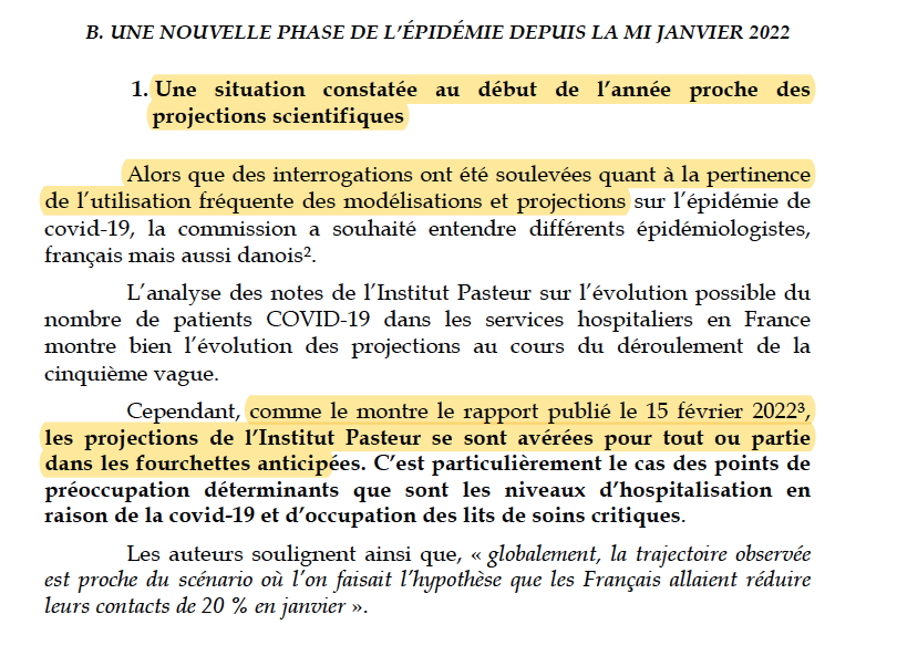
Comparison of scenarios to actual data (click to
unfold)
The report distinguished between “likely” scenarios (solid lines) and “less likely” scenarios (dotted lines). It also distinguished between a hypothesis of 85% or 60% efficacy of the booster dose against infection at 6 months.
The reality is an initial efficacy of 50%, then 0% beyond 3 months (see paragraph “Institut Pasteur’s self-assessment”), excluding at the very least the 85% scenario. However, as the Institut Pasteur uses it to assert in its retrospective report that “the predicted and observed dynamics of daily admissions are close”, we have chosen to represent it.
The peak in critical care beds will occur a few days after publication of the report, instead of the month and a half anticipated. The height of the peak will be slightly below the most optimistic scenario, but more than 2 times less than the median and pessimistic scenarios. The “unlikely” scenarios further overestimate reality.
(Less) false assumption: 60% vaccine effectiveness
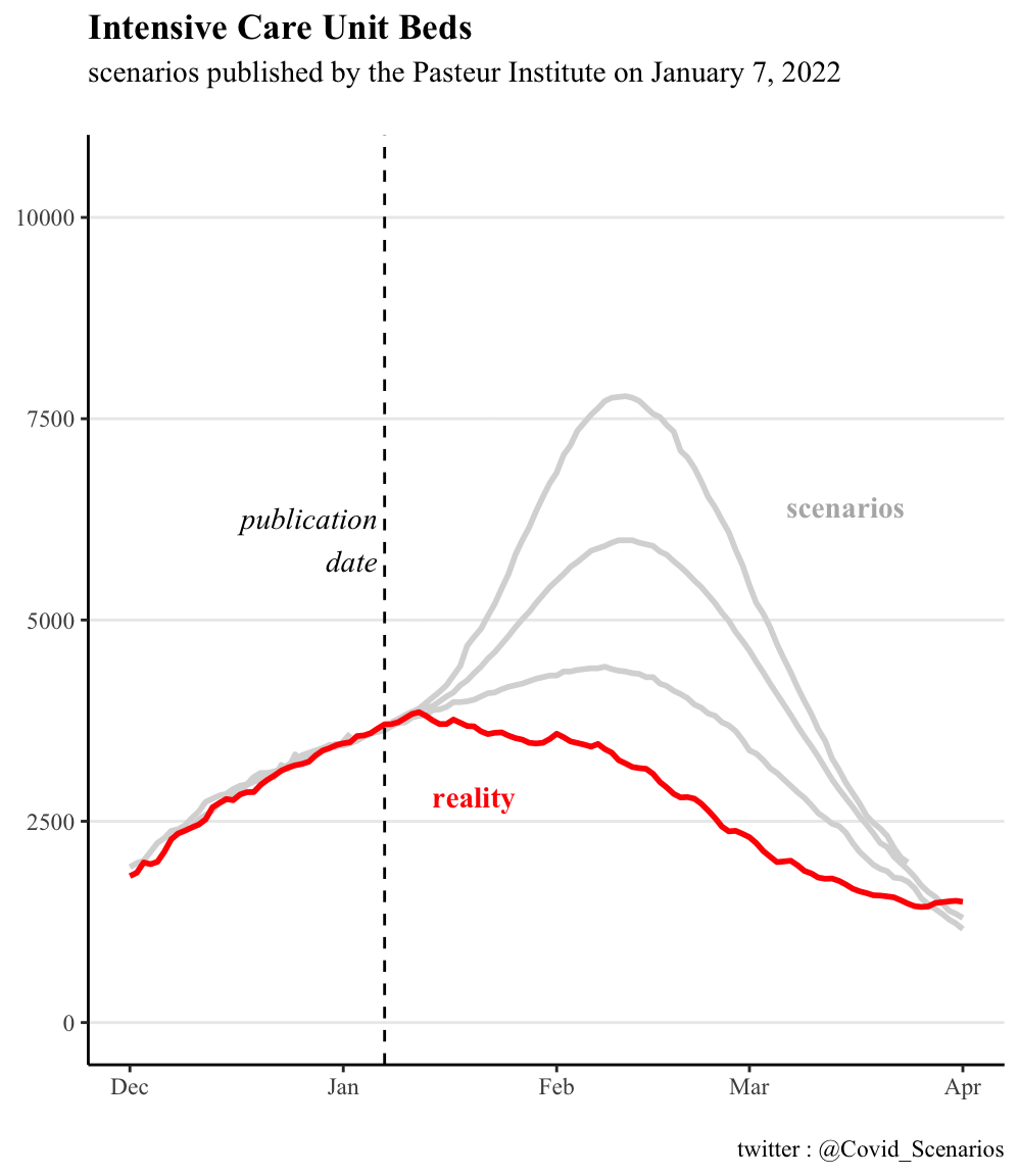
False assumption: 85% vaccine effectiveness
Political and media impact (click to
unfold)
The Pasteur Institute self-evaluation was forwarded to the Senators as part of their inquiry about the adequacy of the vaccine pass to the evolution of the covid-19 epidemic. It is stated that “the projections of the Pasteur Institute have turned out to be within the anticipated ranges”. We detail in the following section the reasons why we think this statement is seriously challenged. Moreover, there is no mention of other past scenarios when the Pasteur Institute was completely wrong, for instance in August 2021 with the sanitary pass
The Pasteur Institut’s self-evaluation report was also quoted in some press articles as saying that “Institut Pasteur was right about almost everything on the impact of Omicron”.
Institut Pasteur self-assessment and discussion of
hypotheses (click to unfold)
Several points raise questions in the self-evaluation conducted by the Institut Pasteur presented below. We note in passing that our own retrospective is consistent with the figure presented by the Institute.
The most obvious one is the total absence of any reference to vaccine efficacy and the choice to represent only the curves illustrating a vaccine efficacy of 85%, contrary to our graphs. However, an official note from DREES explicitly states:
“Beyond three months, the booster dose no longer seems to protect against Covid-19 infections”
At the time of publication of the report, the British surveillance data already indicated a vaccine efficacy of only 50% after 10 weeks, far from 85%. Their more recent data (below) confirm an initial efficacy of 45% and then almost zero after 3 months.
Even journalists correctly identified as early as January 13 that a 85% protection against infections is a “largely incorrect figure”.Could Pasteur’s team have been unaware of these elements at the time of their self-evaluation?
Moreover, unlike us, the self-evaluation does not present the “less likely” scenarios. This raises the question of good practice in retrospective evaluation, to be defined upstream. Would the team have discarded these scenarios if reality had followed them?
We note that while the team regularly insists that “the scenarios are not predictions”, the self-assessment is less cautious, with the term “predicted” recurring several times in the report, e.g., “the predicted and observed dynamics of daily admissions are also close.”
We remind that testing the adequacy of assumptions is important, because as the beginning of each of the Institut Pasteur reports reminds us:
The trajectories described depend on the assumptions made; if the assumptions are not realized, the observed dynamics may differ from the projections.
Yet the Pasteur Institute did not apply its own statement to itself concerning its vaccine efficacy assumption.